The Capacity Planning Template Most Teams Get Wrong (2026)
September 24, 2026
Amir Tavafi
10 min read

Most capacity planning templates ask a manager to guess how busy their team is this week. Abloomify measures it instead, pulling utilization and delivery load straight from GitHub, Jira, and 100+ other connected tools. Here is the actual capacity planning template worth using: the fields that matter, the ones that don't, and why the $500K-$2M a year in hidden capacity waste hides in the gap between the two.
Key Takeaways
Q: What should a capacity planning template actually measure?
A: Not just planned hours per project. A useful capacity planning template tracks committed work, real delivery signals (PR volume, ticket flow, meeting load), and a utilization percentage, so a COO or VP Engineering can see who's overloaded before it adds to the $500K-$2M companies this size typically lose to hidden capacity waste each year.
Q: Is a spreadsheet template enough for capacity planning?
A: For a single team, yes. Past 50-100 people, a spreadsheet capacity planning template runs on manager guesses that go stale within a week. Abloomify's 50-person customer validated this directly: their COO said what he calculated manually in a spreadsheet matched what Abloomify measured automatically, once connected.
Q: How do you fill in a capacity planning template without guessing?
A: Pull real signals instead of asking managers to estimate: calendar load, GitHub or Jira delivery data, and ticket volume. Abloomify does this across 100+ connected tools (Jira, GitHub, Google Workspace, Slack, and more), so the "actual" column reflects real work, not a manager's memory of last week.
Q: Does capacity planning require employee monitoring?
A: No. A privacy-first capacity planning template pulls aggregated signals from tools a team already uses, not screenshots or keystrokes. Abloomify is PII-free by architecture, and about 1 in 6 workers say they would quit over surveillance, per 2026 survey research, which is exactly the trust cost this approach avoids.
What a Capacity Planning Template Should Actually Track
A capacity planning template exists to answer one question for a manager or a COO, does this team have room to take on more work right now, or is it already carrying more than it can handle, and most templates fail at this because they track planned hours per project instead of the signals that actually predict overload, things like meeting density, PR review backlog, ticket volume, after-hours activity, and how a person's committed work compares to what they delivered the week before, so a template built only around a percentage-allocated column (40% Project A, 60% Project B) looks precise while missing the actual driver of burnout and quiet attrition, which is the gap between what someone is scheduled to do and what the underlying work systems show them actually doing.
Here's the split that matters: planned capacity (what a spreadsheet tracks) and real capacity (what work systems show). A template with only the first column tells you what a manager believes. A template with both tells you where the belief is wrong.
Most templates skip the second column entirely because it requires connecting to GitHub, Jira, or a calendar rather than typing a number into a cell. That's the actual reason capacity planning fails at scale. Not bad intentions. Just a missing data source.
The Capacity Planning Template: Fields That Belong In It
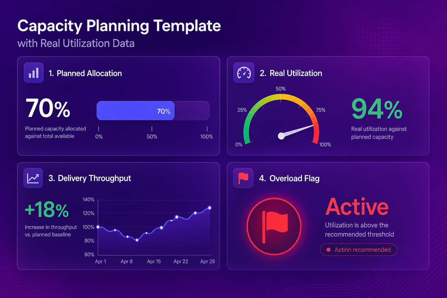
Below is the actual capacity planning template worth copying into a spreadsheet or a project tool, built from the fields that separate a template a COO can trust from one that just looks organized: person or team name, role, planned allocation percentage across active projects, a real-utilization percentage pulled from delivery systems where available, meeting hours per week, delivery throughput compared to the prior four-week average, an overload flag that trips when planned and real utilization diverge by more than roughly 15 to 20 percentage points, and a plain-text context column for the things a number can't capture, like a new hire ramping up or someone covering for a colleague on leave, because a template without room for context turns into a blunt instrument that flags every ramp-up as a crisis.
| Field | What it captures | Where the data comes from |
|---|---|---|
| Person / team | Who this row tracks | HR roster or team list |
| Planned allocation | % of time assigned across active projects | Manager input |
| Real utilization | % of time actually spent on committed work | Calendar, GitHub, Jira signals |
| Delivery throughput | PRs merged or tickets closed vs. 4-week average | GitHub, Jira, Linear |
| Meeting load | Hours per week in meetings | Calendar |
| Overload flag | Trips when planned vs. real utilization gap exceeds ~15-20 points | Calculated |
| Context note | Ramp-up, leave coverage, project handoff | Manager input |
Copy those seven columns into a spreadsheet and you have a working capacity planning template today. The columns aren't the hard part. Keeping the "real utilization" column honest is.
How to Fill In the Template Without Guessing
The planned-allocation column is easy, a manager types in percentages once a quarter and updates them when a project starts or ends, but the real-utilization column is where every spreadsheet-only capacity planning template quietly gives up, because filling it in by hand means someone has to open GitHub to count PRs, open Jira to check ticket velocity, open a calendar to tally meeting hours, and open Slack to guess at collaboration load, four or five tools for one number, repeated for every person on the team, every single week, which is exactly the kind of chasing-people-for-updates busywork that eats a leader's calendar without anyone deciding it should.
I used to think building Abloomify was about building AI for managers. The more we shipped, the clearer it got that the real job was killing the busywork that quietly owns a leader's week: chasing people for status updates, copy-pasting numbers into a deck, and digging across five tools to answer a question as basic as "who is overloaded right now?" A capacity planning template that requires that same digging every week isn't a shortcut. It's just a slower version of the problem.
This is the gap Abloomify's two data layers are built to close: 100+ API integrations (Jira, GitHub, Google Workspace, Slack, and more) for PII-free work signals, plus optional privacy-first device agents that measure aggregated usage patterns with no screenshots, no keyloggers, and no screen recording. The template stays the same seven columns. What changes is whether a person fills in "real utilization" from memory or it fills itself in from what actually happened. That's the same job Abloomify's productivity management does automatically for teams that outgrow the manual version.
"What I did manually this week in a spreadsheet is exactly what I think Abloomify should be doing automatically." That's a COO at a 50-person Canadian SaaS company, describing the capacity planning template he built by hand every week before connecting Abloomify. The app-hours Abloomify measured matched his manual math, which is a low bar to celebrate except that it's the bar most capacity templates never clear.
Reading the Numbers: What the Overload Flag Actually Means
An overload flag tripping on a capacity planning template doesn't mean someone is lazy or a manager assigned too much on purpose, it usually means one of three things, the plan was made before a dependency slipped and nobody updated it, a person is quietly absorbing work that never got formally assigned because they're the one who always says yes, or the team is genuinely short a role and everyone is covering the gap, and a template that only shows the flag without separating these three causes just adds another number to argue about in a status meeting instead of a decision anyone can act on, so the real-utilization column needs a companion, not just red or green, but a short note on which of the three patterns is actually showing up.
Where Spreadsheet Templates Stop Working
A spreadsheet capacity planning template holds up fine for one team of eight people because a manager can hold the real picture in their head and the template is just a way to write it down, but the same template starts falling apart somewhere between 50 and 150 people because nobody can hold that picture anymore, the update cadence slips from weekly to monthly to whenever someone remembers, the real-utilization column goes stale fastest because it was always the most manual part to fill in, and by the time a COO notices a team has been over capacity for two months, the cost has already shown up as missed deadlines, quiet attrition, or a lead quietly checking out, which is a real chunk of where the $500K-$2M in annual capacity waste at companies this size actually comes from. Not one dramatic failure. Just a template nobody kept current.
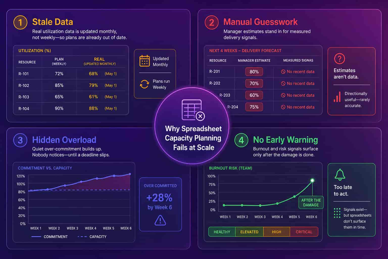
A template is a snapshot. Capacity changes every sprint.
Spreadsheet Template
Abloomify
When to Graduate From a Template to Software
The honest answer is once updating the real-utilization column by hand starts taking longer than the decision it's supposed to inform, which for most engineering and operations teams lands somewhere around 40 to 60 people, two or three teams, or the first quarter a capacity miscall costs a real deadline, and at that point the choice isn't really template versus software, it's manual data entry versus connected data, because every capacity planning tool on the market, Abloomify included, is still built around roughly the same rows and columns as the template above. The only thing that changes is whether a person or an integration keeps them updated.
If that's where you are, the honest 2026 shortlist of capacity planning software compares the tools built for that transition, including where a manual-allocation tool like Tempo still beats a connected one and where it doesn't.
Big companies build a planning ritual around the guess. Growing ones just stop guessing.
FAQ
What is a capacity planning template?
A capacity planning template is a table that compares how much work is planned per person or team against how much capacity they actually have, usually with columns for planned allocation, meeting load, and utilization. The fields in this guide work in a spreadsheet or a project tool. The harder part is keeping the utilization numbers current without a manager retyping them every week.
How often should a capacity planning template be updated?
Weekly, at minimum, for any team where workload shifts sprint to sprint. Monthly updates are common but are also why most templates go stale: a two-week-old utilization number already missed the deadline slip or the person quietly absorbing extra work. Abloomify updates the real-utilization columns continuously from connected tools instead of on a manual cadence.
What's the difference between capacity planning and resource planning?
They overlap, but capacity planning asks the narrower question: does this team have room for more work right now? Resource planning is the broader practice of scheduling people and budget across projects. A capacity planning template is usually the utilization layer inside a larger resource plan, not a replacement for one.
Do I need software to do capacity planning, or is a template enough?
A template is enough for a single team where a manager can track workload from memory, typically under 20 people. Past that, the manual update cost usually exceeds what connected tools charge, because someone is already spending hours a week keeping the spreadsheet honest.

Amir Tavafi
Co-Founder & CEO
Product leader and innovator with over 15 years of experience in the tech sector, grounded in AI and robotics. Previously led product development in fraud detection and AI solutions at Nasdaq Verafin.